wonderfull
A Holistic Wellness Company with Design rooted in Asian Culture and Ideology
logo
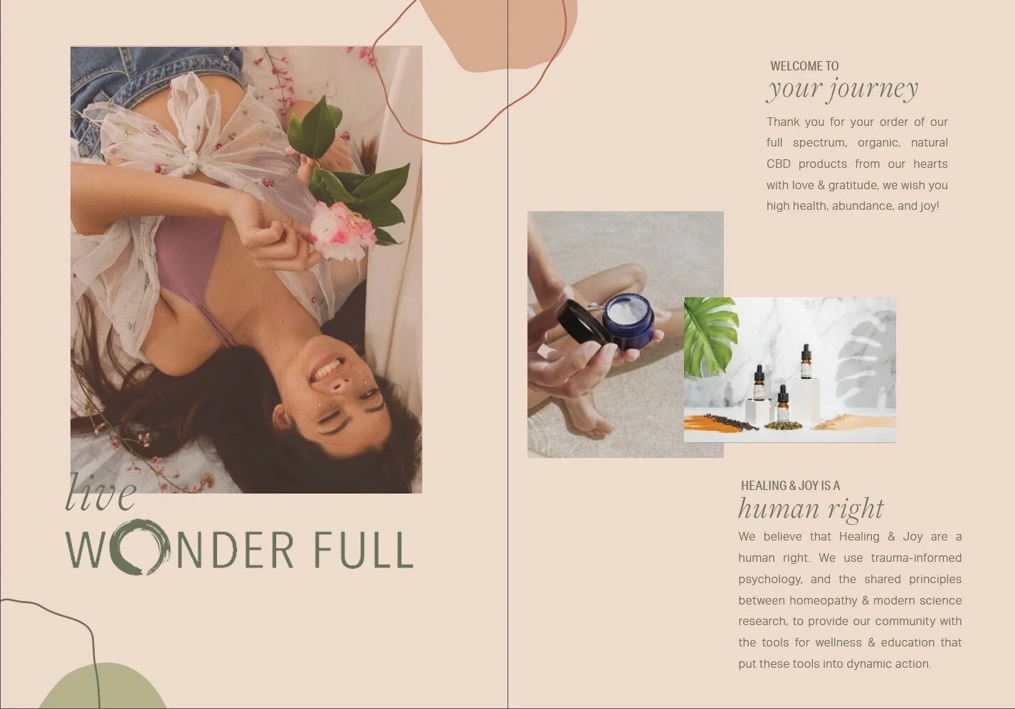
The company came to me wanting a complete rebranding that would better represent their natural healing philosophy. The "o" is a Buddhist symbol called "Enso". Its meaning of enlightenment and completeness perfectly symbolized Wonderfull's brand purpose.
Typography
The typography is cohesive with Wonderfull’s Brand Tone. Wonderfull is committed to empowering their customer with education in printed copywriting. The copywriting comes to life with this typography set. By pairing the simple, straight lines of Aktiv Grotesque with the whimsical serif of italicized FreightDisplay Pro, we embodied Wonderfull’s brand values of the transparency in product formulations, and the inspired-simplicity of our collective return to a more holistic wellness lifestyle.
color palette
Inspired by the 3 elements: Earth, Water, and Fire to connect with the holistic wellness communication pillar. I selected softer tones to represent the inviting and empathetic nature of the brand with the intention to create a more welcoming consumer experience.
packaging experience


Maintained the simplicity of the Wonderfull brand aesthetic, while balancing the complex label requirements of an unregulated product category. In addition to the Ingredients & Usage Directions, I created usable space on multiple faces of product labeling to support an elevated customer experience, including: 1) educational information about CBD 2) a first to market QR code that uses blockchain technology for better transparency on product sourcing, 3) a customized recycling program for the packaging materials to align with the brand’s commitment to sustainability.


